こんにちは。五平餅くんです。 少し特殊な例かもしれませんが、こんな感じの片方だけborder-bottomがコンテンツ幅(インナー)をはみ出す見出しデザインはどのように作れば良いでしょう。 見出しの青い線がコンテンツ幅(インナー)をはみ出している 今回の条件として、青い線は常に画面の左端にくっついて...
最終更新日:
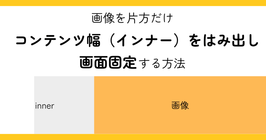
【コピペでOK】画像だけinnerをはみ出して固定するHTML/CSS
こんにちは。五平餅くんです。
Web制作では、テキストは中央の読みやすい幅に収めたいけれど、画像だけは大きく見せたいという要望がよくあります。
さらに「画像を片側に固定して、テキストだけスクロールさせたい」といったレイアウトも使われます。
今回は、画像だけを inner からはみ出しつつ片側に固定(sticky)する方法についてご紹介します。
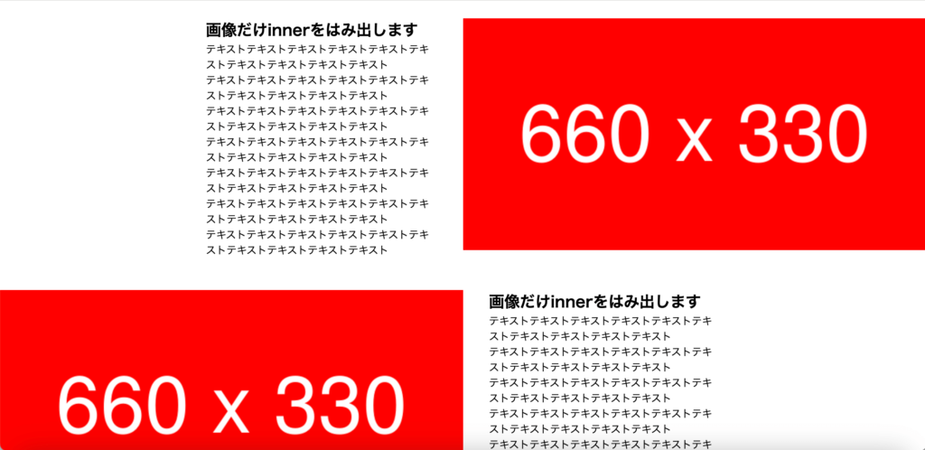
画像だけinnerをはみ出す
まずは基本の「はみ出しレイアウト」です。
<div class="hamidashi-layout-test">
    <div class="hamidashi-layout-test__child1">
      <h2>画像だけinnerをはみ出します</h2>
      <p>テキストテキストテキストテキストテキストテキストテキストテキストテキストテキスト</p>
      <p>テキストテキストテキストテキストテキストテキストテキストテキストテキストテキスト</p>
      <p>テキストテキストテキストテキストテキストテキストテキストテキストテキストテキスト</p>
      <p>テキストテキストテキストテキストテキストテキストテキストテキストテキストテキスト</p>
      <p>テキストテキストテキストテキストテキストテキストテキストテキストテキストテキスト</p>
      <p>テキストテキストテキストテキストテキストテキストテキストテキストテキストテキスト</p>
      <p>テキストテキストテキストテキストテキストテキストテキストテキストテキストテキスト</p>
    </div>
    <div class="hamidashi-layout-test__child2">
      <img src="sample.png" class="img-100" alt="画像の説明">
    </div>
  </div>
  <div class="hamidashi-layout-test">
    <div class="hamidashi-layout-test__child1">
      <h2>画像だけinnerをはみ出します</h2>
      <p>テキストテキストテキストテキストテキストテキストテキストテキストテキストテキスト</p>
      <p>テキストテキストテキストテキストテキストテキストテキストテキストテキストテキスト</p>
      <p>テキストテキストテキストテキストテキストテキストテキストテキストテキストテキスト</p>
      <p>テキストテキストテキストテキストテキストテキストテキストテキストテキストテキスト</p>
      <p>テキストテキストテキストテキストテキストテキストテキストテキストテキストテキスト</p>
      <p>テキストテキストテキストテキストテキストテキストテキストテキストテキストテキスト</p>
      <p>テキストテキストテキストテキストテキストテキストテキストテキストテキストテキスト</p>
    </div>
    <div class="hamidashi-layout-test__child2">
      <img src="sample.png" class="img-100" alt="画像の説明">
    </div>
  </div>
</div>
/* ベース設定 */
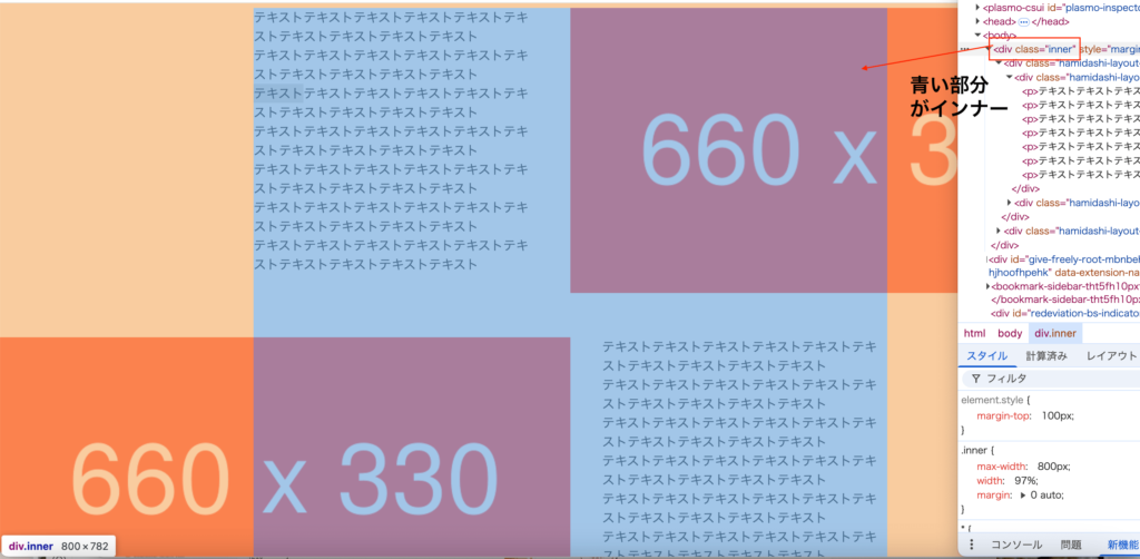
.inner {
max-width: 800px;
width: 97%;
margin: 0 auto;
}
.img-100 {
width: 100%;
height: auto;
}
/* ここから重要! */
.hamidashi-layout-test {
display: flex;
flex-wrap: wrap;
justify-content: space-between;
}
.hamidashi-layout-test__child1 {
width: 45%;
}
@media screen and (max-width: 799px) {
.hamidashi-layout-test__child1 {
width: 100%;
}
}
.hamidashi-layout-test__child2 {
margin-right: calc(50% - 50vw);
width: calc(50vw - 50% + 50%);
}
@media screen and (max-width: 799px) {
.hamidashi-layout-test__child2 {
margin-top: 20px;
margin-left: calc(50% - 50vw);
width: 100vw;
}
}
/* 2つ目設定 */
.hamidashi-layout-test + .hamidashi-layout-test {
margin-top: 50px;
}
.hamidashi-layout-test:nth-child(even) {
flex-direction: row-reverse;
}
.hamidashi-layout-test:nth-child(even) .hamidashi-layout-test__child2 {
margin-right: 0;
margin-left: calc(50% - 50vw);
}
@media screen and (max-width: 799px) {
.hamidashi-layout-test:nth-child(even) .hamidashi-layout-test__child2 {
margin-right: calc(50% - 50vw);
}
}
ポイント
.innerはテキスト用の幅を制御- 画像側は
margin-right: calc(50% - 50vw)を使い、画面端まで広げる
これで テキストは幅(inner)に収まりつつ、画像だけ画面端まで伸びるレイアウトができます。
さらに nth-child(even) を使えば左右交互に配置できます。
片側に固定(sticky)する
次に「画像を片側に固定して、テキストだけ流す」実装です。
<div class="inner" style="margin-top: 100px">
  <div class="hamidashi-layout-test-sticky">
    <div class="hamidashi-layout-test-sticky__child1">
      <div class="hamidashi-layout-test-sticky__txt">
        <h2>stickyにします</h2>
        <p>テキストテキストテキストテキストテキストテキストテキストテキストテキストテキスト</p>
        <p>テキストテキストテキストテキストテキストテキストテキストテキストテキストテキスト</p>
        <p>テキストテキストテキストテキストテキストテキストテキストテキストテキストテキスト</p>
        <p>テキストテキストテキストテキストテキストテキストテキストテキストテキストテキスト</p>
        <p>テキストテキストテキストテキストテキストテキストテキストテキストテキストテキスト</p>
        <p>テキストテキストテキストテキストテキストテキストテキストテキストテキストテキスト</p>
        <p>テキストテキストテキストテキストテキストテキストテキストテキストテキストテキスト</p>
      </div>
    </div>
    <div class="hamidashi-layout-test-sticky__child2">
      <img src="sample.png" class="img-100" alt="画像の説明">
      <img src="sample.png" class="img-100" alt="画像の説明">
      <img src="sample.png" class="img-100" alt="画像の説明">
    </div>
  </div>
</div>
.hamidashi-layout-test-sticky {
display: flex;
flex-wrap: wrap;
justify-content: space-between;
position: relative;/* ここ重要! */
}
.hamidashi-layout-test-sticky__child1 {
width: 45%;
}
@media screen and (max-width: 799px) {
.hamidashi-layout-test-sticky__child1 {
width: 100%;
}
}
.hamidashi-layout-test-sticky__child2 {
margin-right: calc(50% - 50vw);
width: calc(50vw - 50% + 50%);
}
@media screen and (max-width: 799px) {
.hamidashi-layout-test-sticky__child2 {
margin-top: 20px;
margin-left: calc(50% - 50vw);
width: 100vw;
}
}
/* テキストをstickyに */
.hamidashi-layout-test-sticky__txt {
position: sticky;
top: 40px;
right: 0;
padding-bottom: 40px;
}
/* 2つ目設定 */
.hamidashi-layout-test-sticky + .hamidashi-layout-test-sticky {
margin-top: 50px;
}
.hamidashi-layout-test-sticky:nth-child(even) {
flex-direction: row-reverse;
}
.hamidashi-layout-test-sticky:nth-child(even) .hamidashi-layout-test-sticky__child2 {
margin-right: 0;
margin-left: calc(50% - 50vw);
}
@media screen and (max-width: 799px) {
.hamidashi-layout-test-sticky:nth-child(even) .hamidashi-layout-test-sticky__child2 {
margin-right: calc(50% - 50vw);
}
}
ポイント
.hamidashi-layout-test-sticky__child2(画像)は画面端にはみ出す.hamidashi-layout-test-sticky__txtをposition: sticky; top: 40px;にして固定- スクロールしても「画像は片側に残り、テキストだけ流れる」
stickyが効かないケースと注意点
最後に「stickyが効かないNG例」です。
NG例
<div class="inner">
  <div class="hamidashi-layout-test-sticky-not">
    <div class="hamidashi-layout-test-sticky-not__child1">
      <h2>child1にstickyを指定すると効かない</h2>
      <p>テキストテキストテキストテキストテキストテキストテキストテキストテキストテキスト</p>
      <p>テキストテキストテキストテキストテキストテキストテキストテキストテキストテキスト</p>
      <p>テキストテキストテキストテキストテキストテキストテキストテキストテキストテキスト</p>
      <p>テキストテキストテキストテキストテキストテキストテキストテキストテキストテキスト</p>
      <p>テキストテキストテキストテキストテキストテキストテキストテキストテキストテキスト</p>
      <p>テキストテキストテキストテキストテキストテキストテキストテキストテキストテキスト</p>
      <p>テキストテキストテキストテキストテキストテキストテキストテキストテキストテキスト</p>
    </div>
    <div class="hamidashi-layout-test-sticky-not__child2">
      <img src="sample.png" class="img-100" alt="画像の説明">
      <img src="sample.png" class="img-100" alt="画像の説明">
      <img src="sample.png" class="img-100" alt="画像の説明">
    </div>
  </div>
</div>
.hamidashi-layout-test-sticky:nth-child(even) .hamidashi-layout-test-sticky__txt {
right: auto;
left: 0;
}
.hamidashi-layout-test-sticky-not {
display: flex;
flex-wrap: wrap;
justify-content: space-between;
position: relative;
}
/* ここから重要! */
.hamidashi-layout-test-sticky-not__child1 {
width: 45%;
position: sticky;/* ← 効かない */
top: 40px;
right: 0;
padding-bottom: 40px;
}
@media screen and (max-width: 799px) {
.hamidashi-layout-test-sticky-not__child1 {
width: 100%;
}
}
.hamidashi-layout-test-sticky-not__child2 {
margin-right: calc(50% - 50vw);
width: calc(50vw - 50% + 50%);
}
@media screen and (max-width: 799px) {
.hamidashi-layout-test-sticky-not__child2 {
margin-top: 20px;
margin-left: calc(50% - 50vw);
width: 100vw;
}
}
/* 2つ目設定 */
.hamidashi-layout-test-sticky-not + .hamidashi-layout-test-sticky-not {
margin-top: 50px;
}
.hamidashi-layout-test-sticky-not:nth-child(even) {
flex-direction: row-reverse;
}
.hamidashi-layout-test-sticky-not:nth-child(even) .hamidashi-layout-test-sticky-not__child2 {
margin-right: 0;
margin-left: calc(50% - 50vw);
}
@media screen and (max-width: 799px) {
.hamidashi-layout-test-sticky-not:nth-child(even) .hamidashi-layout-test-sticky-not__child2 {
margin-right: calc(50% - 50vw);
}
}
/* sticky効かない */
.hamidashi-layout-test-sticky-not:nth-child(even) .hamidashi-layout-test-sticky-not__child1 {
right: auto;
left: 0;
}これでは sticky が効きません。
なぜ?
stickyは親要素の高さの範囲内でのみ動作- 親と sticky 要素の高さが同じだと「動ける余白がない」ため固定されない
stickyを効かせたい場合は子要素を作ってそこにstickyを指定します。
※ここでいうと hamidashi-layout-test-sticky__txt の部分
    <div class="hamidashi-layout-test-sticky__child1">
      <div class="hamidashi-layout-test-sticky__txt">
        <h2>stickyにします</h2>
        <p>テキストテキストテキストテキストテキストテキストテキストテキストテキストテキスト</p>
        <p>テキストテキストテキストテキストテキストテキストテキストテキストテキストテキスト</p>
        <p>テキストテキストテキストテキストテキストテキストテキストテキストテキストテキスト</p>
        <p>テキストテキストテキストテキストテキストテキストテキストテキストテキストテキスト</p>
        <p>テキストテキストテキストテキストテキストテキストテキストテキストテキストテキスト</p>
        <p>テキストテキストテキストテキストテキストテキストテキストテキストテキストテキスト</p>
        <p>テキストテキストテキストテキストテキストテキストテキストテキストテキストテキスト</p>
      </div>
    </div>
.hamidashi-layout-test-sticky__child1 {
width: 45%;
}
@media screen and (max-width: 799px) {
.hamidashi-layout-test-sticky__child1 {
width: 100%;
}
}
/* ここから重要! */
.hamidashi-layout-test-sticky__txt {
position: sticky;
top: 40px;
right: 0;
padding-bottom: 40px;
}まとめ
- 画像だけをはみ出す →
margin-right: calc(50% - 50vw) - 片側に固定する →
position: sticky; top: 40px; - stickyの注意点 → 親に直接指定せず、子要素を作って指定する
このテクニックを覚えておくと、ヒーローセクションやサービス紹介で「テキストは読みやすく、画像はダイナミックに見せる」表現が簡単にできます。
最後まで読んでいただきありがとうございました!
innerをはみ出すレイアウトに関連する記事↓
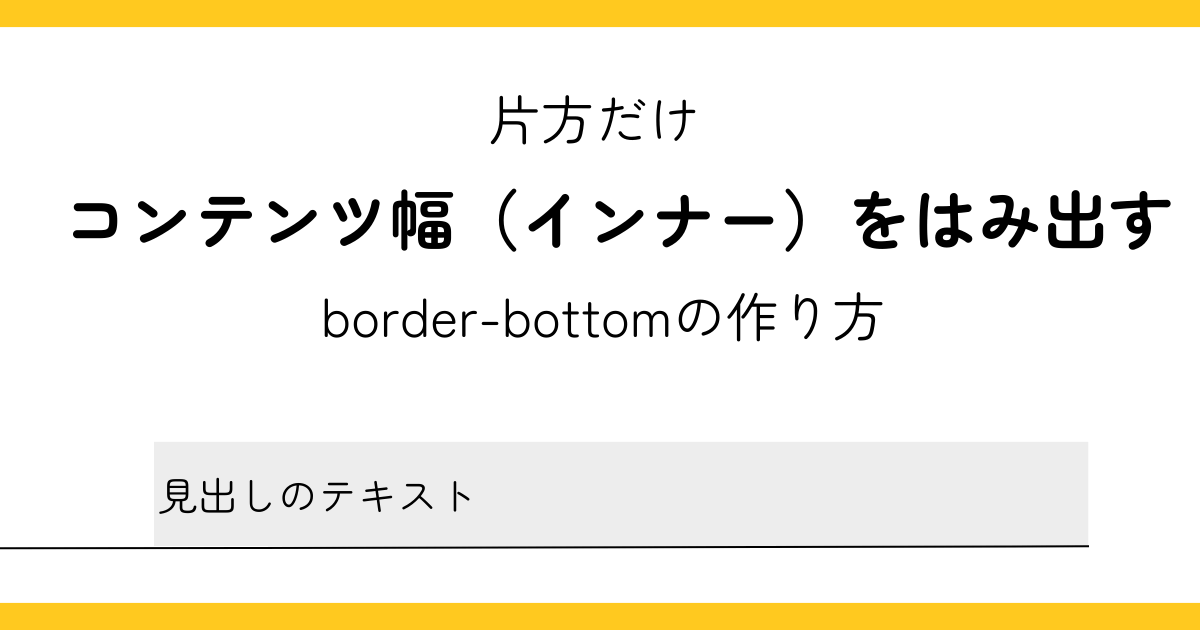
片方だけコンテンツ幅(インナー)をはみ出すborder-bottomの作り方
フリーランスとしてこのスキルをどう仕事につなげるかについては、noteで詳しく書いています。
興味のある方はぜひ。
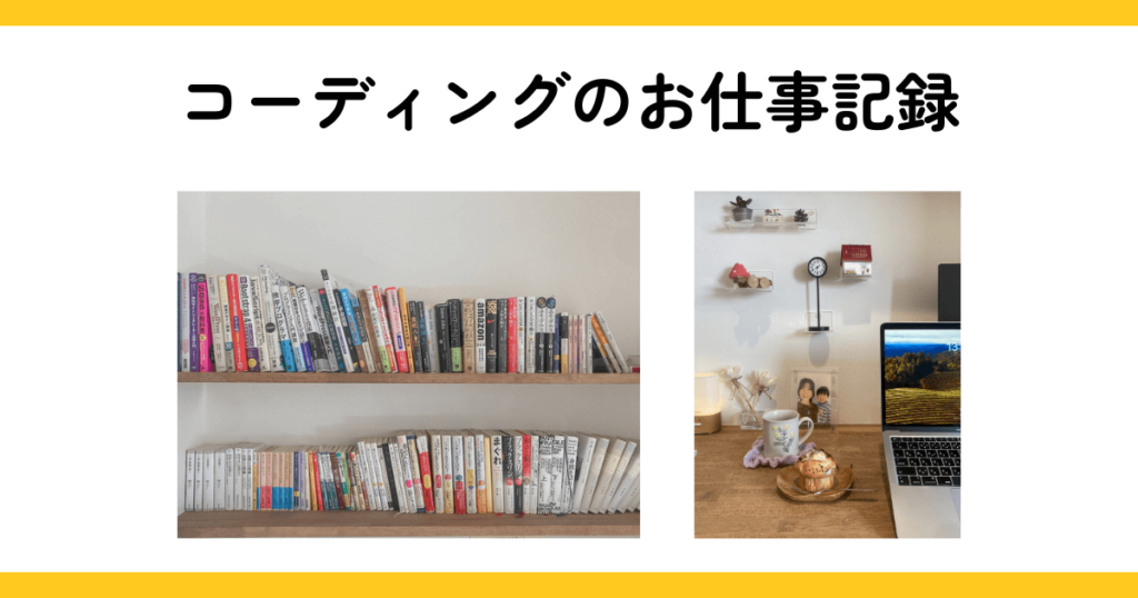
書斎+コーディング+仕事
フリーランス歴:7年
好きなもの:本・お菓子作り
フリーランス/在宅ワーク/独立に向けて勉強中の方が、ワクワクする作業スペースや快適なお仕事環境を作ることで、仕事がだんだん楽しくなることを願う30歳